






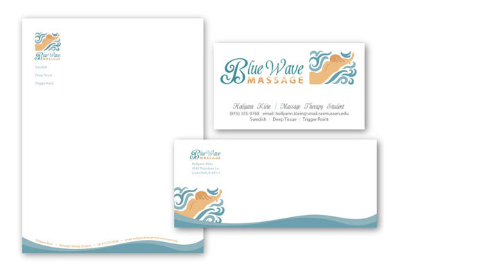
An aspiring massage therapist wanted a great identity for beginning Blue Wave Massage that would communicate her ideal of the calming waves of the ocean. We developed an identity that emphasized the ocean theme, working with the flow of the ocean and it’s relation to the flow of the body in massage.
The waves and illustration lend a flow and enjoyment to the identity, while the calm flow of the body parallels between the image of the massage recipient and the word massage in the logotype. The design of the stationary continues this flow, while emphasizing a calmness in the simple design and serene supporting text. All the while, the imagery has a subtle upbeat element to it and a uniqueness to keep it from melding with the standard massage company aesthetic.
Credits: Logo, illustration, and design by Josh Parkinson
Get the Resonate Insights email newsletter filled with tips for building your platform, growing your impact, and driving results from your website. You'll recieve your free tips and valuable articles 1-2 times a month, including strategies, tools, resources, and the latest news essential to developing your web leadership.
×