



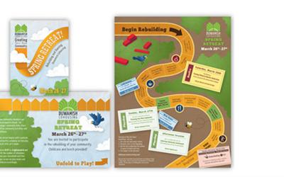

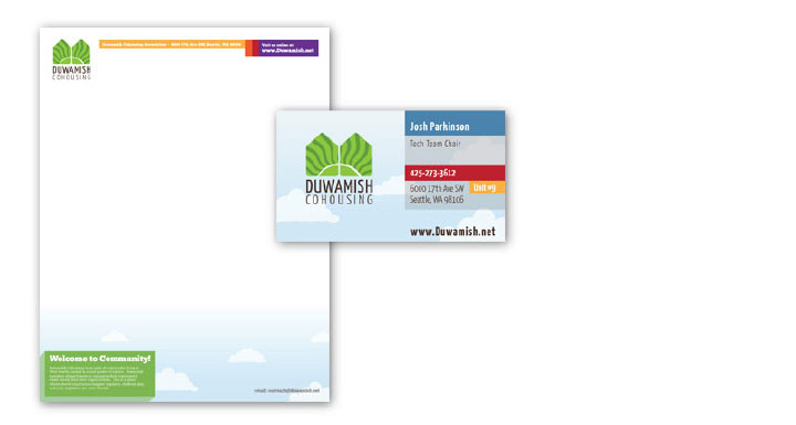
The cohousing community of the Duwamish Cohousing Association has been in a process of rebirth and revitalization, and was in need of a rebranding to update it’s identity and create an inviting professional presence. We developed a rebranding of Duwamish Cohousing complete with a fresh identity and public website to attract new members and awareness of this West Seattle cohousing community. Brand components were created that were never developed such as style guides and messaging for the new brand.
The original logo was a complex, circular design that suffered from poor legibility and the full spectrum of colors (see below for the original compared to the new). A process of creating a new logo for their identity was started to capture the symbolic elements represented in their ribbon circle, their community, and what they needed to project publicly. The ribbon circle is a long standing tradition and literal circle of ribbons, with each ribbon contributed by each new member of the community. All the many and diverse ribbons are tied to a large ring.
We tamed the original concept and added other elements the represent the community. The new identity tied together the homes of the community, and radiates out as an optimistic new dawn. There are many separate homes and families, but they are all tied together by their community, however diverse it may be. The green points the very strong natural element of the community, both in green sustainability practices and in the physical environment. The community was built with sustainability designed from the start. And the lush landscaping, food gardens, and natural forest and maintained wetland surround and infuse the community.
Limiting the color palette and simplifying the prominent shapes creates a more powerful singular presence, and a more powerful symbol as a logo. In the cohousing world, the design also speaks to unique elements of their particular cohousing. There are many different types of cohousing, including those who live in the same home. The logo symbolism for Duwamish shows how this particular cohousing consists of separate homes, yet are united and bound to each other through community.
The greater style of the brand, however, brings back and communicates the diversity and rainbow of bright positive colors. We weave in an optimistic view of community to appeal to those seeking a tight cohousing community. It also communicates both the Spring of rebirth of the community and its renewed energy, and a friendly environment for families and young children. All of these elements are core elements of the Duwamish Cohousing community.
Credits: Logo and Design by Josh Parkinson
Get the Resonate Insights email newsletter filled with tips for building your platform, growing your impact, and driving results from your website. You'll recieve your free tips and valuable articles 1-2 times a month, including strategies, tools, resources, and the latest news essential to developing your web leadership.
×