





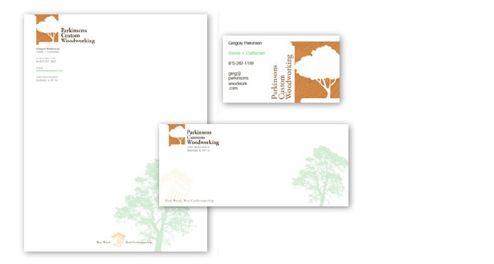
In developing the identity and logo for Parkinsons Custom Woodworking, we needed to reference their focus on using real wood and hand crafted quality. As a furniture maker, we incorporated the subject of most of their work – cabinets and similar units – as the primary image while superimposing their over-riding theme of the use of real wood, as opposed to particle boards as most manufacturers do. The wood grain lends both to subtle tactile feel while showing the use of real wood boards. The tree overlaid as negative space, meanwhile, references the origin of the materials being directly from true lumber. The tree image also gives a slightly green feel, referencing the use of the renewable natural resource without the high amount of chemical binders and formaldehyde based resins needed to produce particle board, and their resulting continuous outgasing of noxious fumes over time. The historic Garamond serif font references an older time when fine craftsmanship in real wood furniture was highly valued and common, which itself originates from the 1500s in physical letterpress print shops.
Making the clean use of the logo in business cards and stationary, we made it more dynamic by running the logo’s image off the page, making the whole space more visually interesting. The iconic image allowed us to re-arrange the logotype around it without affecting the recognition of the logo.
Credits: Logo and design by Josh Parkinson
Get the Resonate Insights email newsletter filled with tips for building your platform, growing your impact, and driving results from your website. You'll recieve your free tips and valuable articles 1-2 times a month, including strategies, tools, resources, and the latest news essential to developing your web leadership.
×