
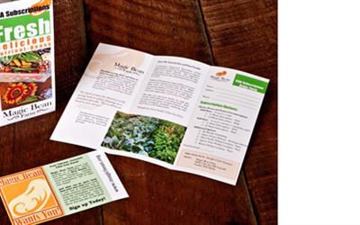

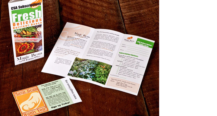
In developing the brochure for Magic Bean Farm, we had a collection of great photography we had taken of the urban farms supplying their CSA. Developing around the beauty and lushness of their farm, and all the color there, we developed an elegant brochure with simple design that highlights the imagery and the logo. The design also provides highly readable content that describes their in depth ecological and nutrient dense processes. Their methods help set them apart from other farms in the quality of their produce and sustainability. The images reinforce the ecological methods they use, and highlights the beauty that attracts the viewer to their produce.
With such a great, playful name, we ensured that energy was captured even in such a minimalist, elegant design through the use of saturated color and playful typography of the cover. The layout continues to feel open thanks to a good use of white space and order, while incorporating a large amount of information, and a subscription form.
We also produced a very simple postcard handout with a great, elegant play on their logo and their desire to reach out to the community.
Credits: Design, logo, and photography by Josh Parkinson
Get the Resonate Insights email newsletter filled with tips for building your platform, growing your impact, and driving results from your website. You'll recieve your free tips and valuable articles 1-2 times a month, including strategies, tools, resources, and the latest news essential to developing your web leadership.
×