








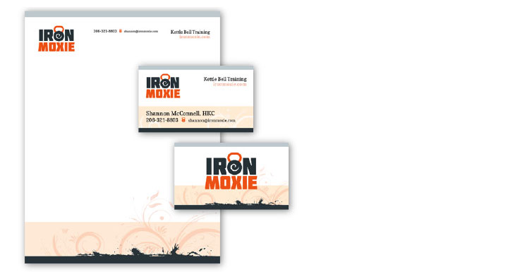
IronMoxie, a new kettle bell fitness training company, needed an identity that communicated the signature kettle bell shape while communicating a combination of gritty hardness with a more feminine moxie. The combination creates interest through contrast and complexity, while the warm colors help offset the coldness of the iron blue. Warmth helps with the activity and excitement needed by a fitness company, while the iron acts as an accent for impact with the gritty hard core feeling of serious workouts. In concert with the playful supporting fonts and swirls, it also helps create a feeling of fun and good natured warmth, essential for the company’s brand.
The logotype was modified from a font chosen for combining the qualities of both the tough iron and playful moxie. Using a single font instead of two helped ensure simplicity and consistency, creating a stronger visual element for their identity. The additional flourish of the letterhead and business cards become part of the identity, extending the concepts developed in the logo and branding of the business.
Credits: Logo and Design by Josh Parkinson
Get the Resonate Insights email newsletter filled with tips for building your platform, growing your impact, and driving results from your website. You'll recieve your free tips and valuable articles 1-2 times a month, including strategies, tools, resources, and the latest news essential to developing your web leadership.
×